Best Free Online Concept Map Maker for Clearer Thinking
If your notes feel scattered, a concept map can help you see what belongs together, what causes what, and where your understanding is still weak. The challenge is choosing a free online concept map maker that supports actual thinking, not just attractive boxes and arrows.
For most people, the best choice depends on the job. If you want a flexible, no-cost diagram canvas, start with diagrams.net. If you need live collaboration, FigJam or Miro may fit better. If you are trying to understand a dense article, PDF, lecture, or video before you map it, pair a visual tool with an AI reading companion like unrav.io.
The goal is not to create the prettiest map. The goal is to make relationships visible so you can study faster, explain more clearly, and make better decisions.
What makes a concept map useful?
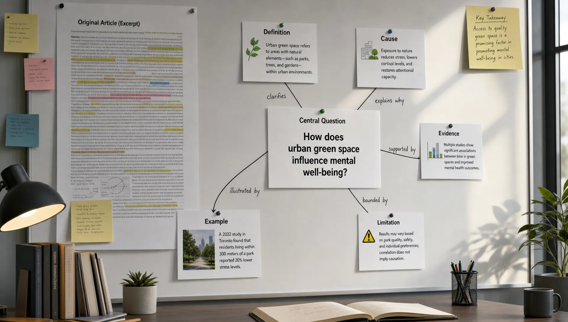
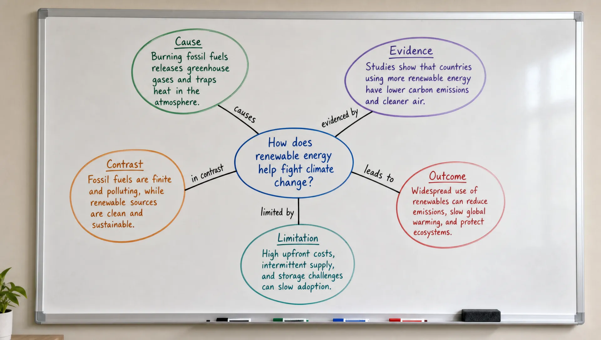
A concept map is different from a simple diagram because it shows relationships between ideas. A good concept map usually includes concepts, connecting lines, and relationship labels such as “causes,” “depends on,” “contrasts with,” “leads to,” or “is measured by.”
In the classic framework from Joseph Novak and Alberto Cañas, concept maps are built around propositions, which are meaningful statements formed by connecting concepts with linking words. The IHMC explanation of concept maps is still one of the clearest references if you want the learning theory behind the method.
For everyday use, you do not need to become a theory expert. You only need to remember this: a concept map should help you answer a question.
For example, instead of mapping “climate change,” use a focus question like “How do greenhouse gases affect global temperature?” Instead of mapping “market strategy,” use “Why is this company losing share in one customer segment?” A focused question prevents the map from becoming a messy cloud of related terms.
Best free online concept map makers at a glance
The tools below have free online options, but free-plan limits can change. Before using one for a class, research project, client deliverable, or team workflow, check the current plan details for privacy, exports, collaboration, and storage.
| Tool | Best for | Why it helps | Watch for |
|---|---|---|---|
| diagrams.net | Flexible manual concept maps | Free browser-based diagramming with many shapes, arrows, and layout options | More manual setup than template-first tools |
| FigJam | Collaborative learning and workshops | Real-time whiteboarding, sticky notes, comments, and simple diagramming | Best if your group is comfortable with online whiteboards |
| Miro | Team brainstorming and research synthesis | Large visual boards, templates, and workshop-friendly collaboration | Can feel too broad if you only need a small map |
| Coggle | Quick student-friendly maps | Simple branching structure with a low learning curve | Free privacy and export options may be limited |
| Lucidchart | Formal diagrams and polished maps | Strong diagramming controls, templates, and clean exports | Free plans usually include document or object limits |
| Canva | Presentation-ready concept maps | Attractive templates for slides, handouts, and teaching materials | Less ideal for complex, heavily cross-linked reasoning |
| unrav.io | Understanding source material before mapping | Helps reframe articles, PDFs, videos, podcasts, links, and pasted text into clearer outputs | Not a traditional drag-and-drop diagram canvas |
Best overall free canvas: diagrams.net
If you want a free online concept map maker with the fewest constraints, diagrams.net is one of the strongest starting points. It is a general diagramming tool rather than a dedicated study app, which is part of its strength. You can create nodes, arrows, groups, swimlanes, tables, icons, and custom layouts without being forced into one visual style.
It works well for students mapping a chapter, researchers organizing a paper’s theory and methods, analysts connecting causes in a report, and professionals building a strategy map. You can start with a blank canvas and gradually build a structure that matches the complexity of your material.
The tradeoff is that diagrams.net will not do much thinking for you. You need to decide which concepts matter, how they connect, and what the relationship labels should say. If you already know the structure, it is excellent. If you are still trying to understand the material, you may need a separate reading or note-making step first.
Best for collaboration: FigJam or Miro
If you are mapping with a study group, research team, classroom, or workshop audience, collaboration matters more than perfect formatting. FigJam and Miro are both strong choices because they let people add ideas, move clusters, comment, and revise the map together in real time.
FigJam is especially useful when your group already uses Figma or wants a lightweight, approachable whiteboard. It works well for brainstorming concepts before turning them into a more structured map.
Miro is better when the concept map is part of a larger workflow, such as a workshop, product discovery session, research synthesis, or planning exercise. You can place notes, screenshots, diagrams, timelines, and maps on one large board.
For solo learners, both tools can be more than you need. For groups, they reduce friction because everyone can contribute without passing around screenshots or slide files.
Best for fast student maps: Coggle
Coggle is useful when speed matters. If you need to prepare for an exam, organize lecture notes, or create a simple map for a class assignment, its branching structure helps you get ideas out quickly.
It is closer to a mind map tool than a fully flexible concept mapping system, but that is not always a problem. Many learners benefit from starting with a simple hierarchy before adding richer relationship labels. For example, you might begin with “cell respiration,” branch into “glycolysis,” “Krebs cycle,” and “electron transport chain,” then add connection labels that explain sequence, inputs, and outputs.
Coggle is a good fit when you want the map to stay simple. If you need many cross-links, formal relationship labels, or a complex research synthesis, a more flexible diagramming tool may be better.
Best for polished maps: Lucidchart or Canva
Lucidchart is a good option when the concept map needs to look formal. It is useful for business, education, technical documentation, and reports where visual clarity matters. The shapes, connectors, alignment tools, and templates make it easier to create something clean enough to share with others.
Canva is better when the final map needs to fit into a slide deck, worksheet, newsletter, or classroom handout. Its templates are approachable and visually polished, which helps educators, content creators, and trainers turn complex material into something more inviting.
The downside is that visual polish can become a distraction. A concept map is useful because the relationships are accurate, not because the colors match perfectly. Start with structure first. Make it pretty later.
Best AI companion for source-heavy maps: unrav.io
Many people do not struggle with drawing the concept map. They struggle with the step before drawing: figuring out what the important concepts are in the first place.
That is especially true when your source is a research paper, policy report, textbook chapter, YouTube lecture, podcast, technical article, or long PDF. You may read the whole thing and still feel unsure which ideas are central and which are supporting details.
This is where unrav.io can help. It is not a traditional concept map canvas. Instead, it helps you understand and reframe content before you decide what belongs in your map. You can use it with links, pasted text, YouTube videos, PDFs, and podcasts, then switch thinking modes depending on your goal, such as getting a quick grasp or turning the material into something easier to teach.
A practical workflow is to use unrav.io to clarify the material first, then move the core concepts and relationships into a visual mapping tool. For example, a researcher might use it to identify a paper’s research question, method, findings, limitations, and related theories. A student might use it to turn a dense reading into a teachable explanation, then map the explanation visually.
If your main problem is dense reading, you may also find this guide on concept map maker tips for complex topics and dense reading useful before choosing a tool.
How to choose the right free concept map maker
The best tool is the one that matches your thinking problem. Before you sign up for anything, ask what kind of work the map needs to do.
If you are studying for an exam, choose a tool that is fast and easy to revise. If you are synthesizing research, choose a tool that supports cross-links, hierarchy, notes, and source references. If you are teaching, choose a tool that helps you simplify without losing accuracy. If you are working with a team, prioritize comments, sharing, and real-time editing.
Use this simple checklist:
- Relationship labels: Can you label lines clearly, or does the tool only support basic arrows?
- Cross-links: Can one concept connect to several others without the layout becoming unreadable?
- Revision speed: Can you move groups of ideas quickly as your understanding changes?
- Export options: Can you save the map in a format that works for your class, team, or project?
- Collaboration: Can others comment, edit, or review the map without creating confusion?
- Privacy: Are your maps private enough for research notes, client work, or unpublished ideas?
A simple tool is often better at the beginning. A more structured tool becomes useful when you need to share, defend, or reuse the map.
A simple workflow for clearer thinking
A concept map is not just a drawing task. It is a reading, filtering, and reasoning task. Use this workflow whether you are working in diagrams.net, FigJam, Miro, Coggle, Lucidchart, Canva, or another free online concept map maker.
- Start with a focus question: Write the question at the top of your page or canvas. Examples include “Why did this experiment produce these results?” or “How does this theory explain the case study?” This keeps the map from drifting into unrelated detail.
- Collect the key concepts: Pull out the main terms, claims, variables, events, people, methods, or arguments. Do not draw yet. Just collect candidates. If you are starting from long content, use your highlights, notes, or an AI reading companion to reduce the material to manageable pieces.
- Group related ideas: Place similar concepts near each other. For a research paper, you might group theory, method, evidence, findings, and limitations. For a business report, you might group market forces, customer behavior, risks, and recommended actions.
- Label the relationships: Replace vague arrows with meaningful phrases. “A affects B” is better than an unlabeled line. “A increases B under these conditions” is even better. Relationship labels are where the real thinking happens.
- Add evidence where needed: If a claim depends on a statistic, quote, study, or section of a source, add a small note. This is especially important for researchers, analysts, and students writing papers.
- Revise for clarity: Remove weak connections, combine duplicate concepts, and move secondary details out of the center. A clear map is not the map with the most nodes. It is the map where the important relationships are easiest to see.
Concept map vs mind map: which one should you use?
Concept maps and mind maps are often confused, but they serve different purposes.
A mind map usually starts with one central idea and branches outward. It is excellent for brainstorming, planning content, outlining a lecture, or organizing a topic quickly.
A concept map is better when you need to explain relationships. It can show hierarchy, cause and effect, evidence, exceptions, feedback loops, and cross-links between ideas.
| Use a mind map when... | Use a concept map when... |
|---|---|
| You are brainstorming ideas quickly | You are explaining how ideas relate |
| You want a simple hierarchy | You need cross-links between concepts |
| You are planning an outline | You are studying a system, theory, or argument |
| You want speed over precision | You want precision over speed |
If you are still deciding between formats, this comparison of mind map generator free tools that help you think clearly can help you choose the right visual method.
Examples by audience
Different readers use concept maps for different reasons. The structure should change based on the task.
| Audience | Example focus question | Useful map structure |
|---|---|---|
| Students | “How does this chapter’s main theory explain the examples?” | Main theory, key terms, examples, exceptions, exam prompts |
| Researchers | “How do the method and findings support the paper’s claim?” | Research question, method, data, findings, limitations, prior work |
| Professionals | “What factors are driving this business problem?” | Causes, symptoms, stakeholders, constraints, decisions, risks |
| Content creators | “How can this long article become a useful script or newsletter?” | Core idea, supporting points, audience questions, examples, takeaways |
| Educators | “What must learners understand before this topic makes sense?” | Prerequisites, misconceptions, main concepts, examples, assessment ideas |
If your maps often look tidy but do not help you remember or explain the material, the issue may be structure rather than design. This article on how to build better visual notes with a concept mapping generator goes deeper into that problem.
Common mistakes to avoid
The first mistake is using too many unlabeled lines. An arrow without a label rarely explains anything. If you cannot name the relationship, you may not understand it yet.
The second mistake is mapping every detail. A concept map is not a transcript, outline, or full set of notes. It should show the structure of understanding, not every sentence from the source.
The third mistake is starting with design. Colors, icons, and templates are useful only after the logic is clear. A beautiful map with weak relationships will not help you study, teach, or decide.
The fourth mistake is treating AI output as final. AI can help you extract concepts, simplify language, and suggest structure, but you still need to check the relationships against the source. This is especially important for research, technical work, legal material, medical content, or anything that affects decisions.
The fifth mistake is using one tool for every task. A quick exam review map, a collaborative research synthesis, and a polished teaching handout may need different tools.
Frequently Asked Questions
What is the best free online concept map maker? For a flexible free canvas, diagrams.net is a strong starting point. For collaboration, FigJam or Miro may be better. For simple student maps, Coggle is easy to use. If your challenge is understanding source material before mapping, use a reading companion like unrav.io alongside your visual tool.
Is a concept map the same as a mind map? No. A mind map usually branches from one central idea, while a concept map shows labeled relationships between multiple concepts. Mind maps are useful for brainstorming. Concept maps are better for explaining systems, arguments, causes, and evidence.
Can AI create a concept map from a PDF or video? AI can help extract concepts, summarize sections, and suggest relationships from a PDF, article, video, or podcast. You should still review the output, correct weak links, and verify important claims against the original source.
What should I write on the lines in a concept map? Use short relationship phrases such as “causes,” “requires,” “contrasts with,” “is supported by,” “leads to,” “is measured by,” or “depends on.” These labels turn a visual diagram into an explanation.
Do I need design skills to make a good concept map? No. A useful concept map needs clear concepts, accurate relationships, and a focused question. Good design helps readability, but it cannot replace clear thinking.
Make complex material easier to map
The best free online concept map maker is the one that helps you think more clearly at the moment you need it. Use diagrams.net for flexible manual maps, FigJam or Miro for collaboration, Coggle for fast student maps, and Lucidchart or Canva when presentation quality matters.
If the hard part is understanding the source before you draw, start with unrav.io. Use it to turn dense articles, PDFs, videos, podcasts, or pasted text into clearer explanations, then build your concept map from ideas you actually understand.