Build Better Visual Notes With a Concept Mapping Generator
If your notes look neat but still do not help you understand the material, the problem may not be your handwriting, app, or color system. The problem is often structure. Linear notes capture information in the order you found it. Complex topics rarely work that way.
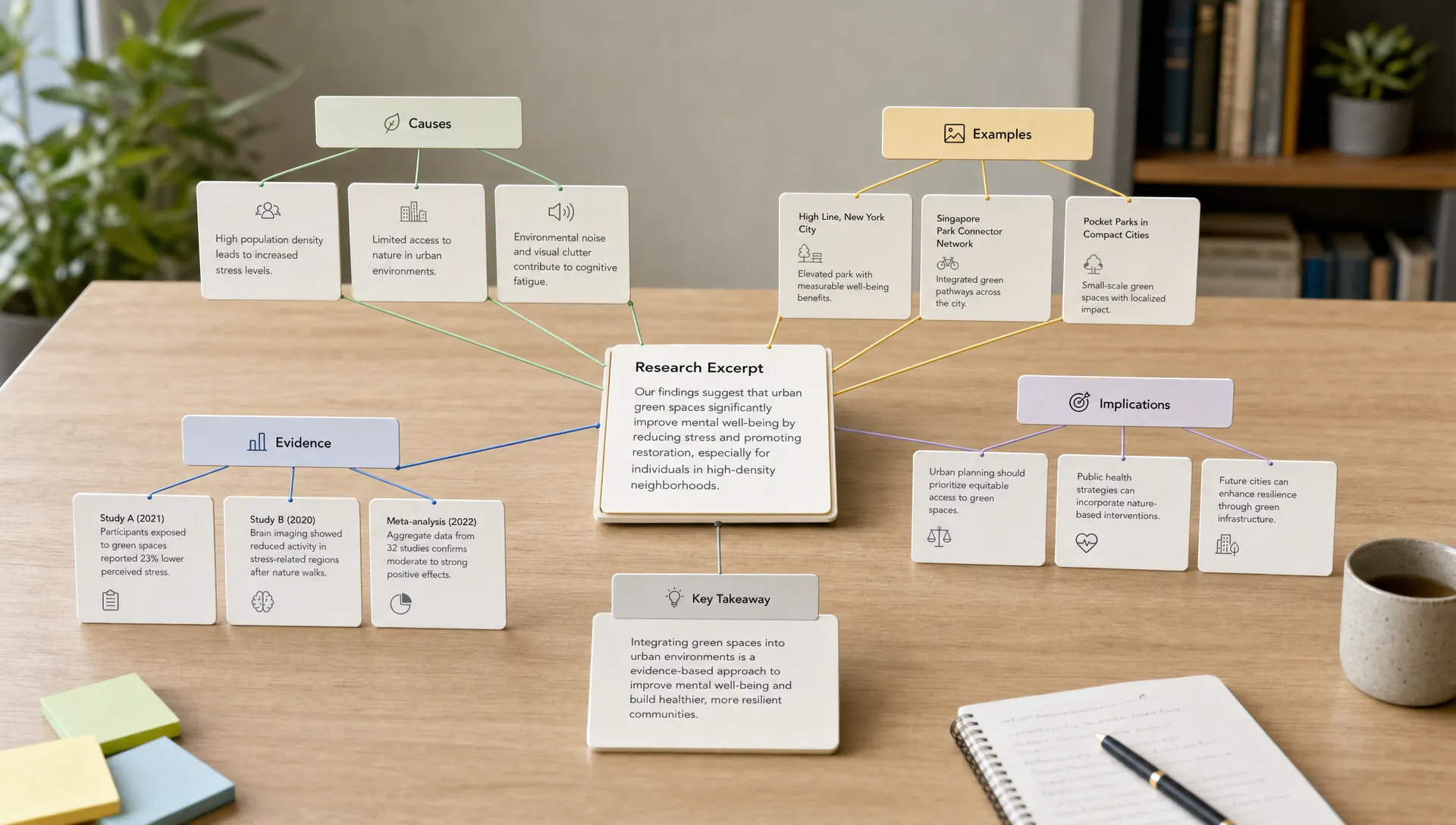
A concept mapping generator helps by turning scattered information into a visual network of ideas, relationships, causes, examples, and evidence. Used well, it can make research papers easier to unpack, lectures easier to review, and long reports easier to explain to someone else.
Used poorly, it can create a nice-looking diagram that does not improve understanding.
This guide shows how to use a concept mapping generator to build better visual notes, not just prettier ones. You will learn what to map, how to prompt the tool, how to revise the output, and how to turn the final map into something useful for studying, research, writing, or decision-making.
What a concept map is, and why it helps visual notes
A concept map is a visual note-taking format that shows concepts as nodes and relationships as connecting lines. Unlike a simple brainstorm, a good concept map explains how ideas relate.
For example, instead of placing “climate change,” “crop yields,” and “water stress” near each other, a concept map might show:
“Climate change increases water stress, which can reduce crop yields in drought-prone regions.”
That sentence-like connection is the point. Concept maps are not just collections of keywords. They are maps of meaning.
The method is closely associated with Joseph Novak’s work on meaningful learning. The Institute for Human and Machine Cognition explains that concept maps usually include concepts, linking words, and propositions, which are meaningful statements formed by two or more concepts connected by labeled relationships.
That structure makes concept maps especially useful when your reading involves:
- Multiple causes and effects
- Competing theories or frameworks
- Dense terminology
- Research methods and findings
- Systems, processes, or workflows
- Arguments with evidence and counterarguments
If you are working with dense academic or technical content, you may also find it useful to review these concept map maker tips for complex topics and dense reading, especially when the relationships are harder to see than the main ideas.
Concept map vs. mind map: choose the right visual note format
People often use “concept map” and “mind map” interchangeably, but they are not the same. Both can help you think visually, but they solve different problems.
A mind map usually starts with one central idea and branches outward. It is great for brainstorming, planning, and getting ideas out of your head quickly. A concept map is more relational. It can have multiple centers, cross-links, and labeled connections.
| Visual note type | Best for | Structure | Relationship labels |
|---|---|---|---|
| Mind map | Brainstorming, planning, outlining, quick idea capture | Usually radial, from one central topic | Often optional or minimal |
| Concept map | Understanding complex topics, studying systems, comparing ideas | Networked, with cross-links between concepts | Important for clarity |
| Flowchart | Explaining steps, decisions, or processes | Sequential or decision-based | Usually shown through arrows and conditions |
| Argument map | Evaluating claims, evidence, objections, and assumptions | Claim-evidence structure | Important for reasoning |
If your goal is to brainstorm an essay topic, a mind map may be enough. If your goal is to understand why one idea causes, supports, contradicts, or depends on another, a concept map is usually better.
For a broader comparison of visual thinking tools, this guide to free mind map generator tools can help you decide when a simpler branching format is a better fit.
What a concept mapping generator can do well
A concept mapping generator is most useful when it gives you a starting structure. It can scan a source, identify important ideas, group related concepts, and suggest relationships you may have missed.
For students, that can mean turning a chapter into a study map. For researchers, it can mean extracting theory, methods, findings, and limitations from a paper. For professionals, it can mean converting a long strategy document into a clearer model of priorities, risks, and dependencies.
A good generator can help you:
- Identify the main concepts in a source
- Group related ideas into clusters
- Suggest cause-effect, part-whole, or example relationships
- Create a first draft of visual notes
- Reveal gaps where you need to reread
- Turn long content into a structure you can review faster
The key phrase is “first draft.” A generator can help you see structure quickly, but you should still review the map. AI tools can misread nuance, flatten disagreements, or make weak links look certain. The best results come from using the tool as a reading companion, then applying your own judgment.
Start with the question your map should answer
The most common mistake is asking a concept mapping generator to “map this article” without giving it a purpose. That usually produces a generic summary diagram.
Before generating anything, write one focus question. This question determines what belongs on the map and what should be left out.
For example:
| Source | Weak mapping goal | Better focus question |
|---|---|---|
| Research paper | Map this paper | How do the authors connect their method to their main finding? |
| Textbook chapter | Summarize this chapter visually | What are the main causes, effects, and examples of this concept? |
| Business report | Create a concept map | What risks, assumptions, and recommendations drive the report’s conclusion? |
| YouTube lecture | Make notes | What framework does the speaker use to explain the topic? |
| Podcast interview | Extract ideas | Which claims, examples, and practical lessons repeat across the conversation? |
A focus question keeps your visual notes from becoming a messy wall of terms. It also makes the generator more useful because it gives the AI a job beyond summarization.
How to use a concept mapping generator step by step
A strong workflow has three parts: prepare the source, generate the structure, then revise the map manually. Skipping the revision step is where many visual notes lose value.
1. Choose the right source material
Concept maps work best when the material contains relationships. A short announcement may not need one. A dense paper, long lecture, policy brief, market report, or technical explanation usually does.
If you are working from multiple sources, start with one source first. Generate a map for each major source, then combine them later. This prevents the generator from mixing arguments before you understand them.
For long PDFs, articles, or videos, it can help to first get a clearer understanding of the content before mapping it. unrav.io is useful at this stage because it can help reframe articles, PDFs, YouTube videos, podcasts, or pasted text into clearer outputs depending on your goal, such as quick grasping or teaching. That makes it easier to see what should become a node, a cluster, or a relationship in your map.
2. Extract concepts, not sentences
A concept map is not a paragraph broken into bubbles. Ask the generator to identify short concept labels. These are usually nouns or noun phrases, such as “working memory,” “retrieval practice,” “sample size,” “market segmentation,” or “energy demand.”
Avoid full-sentence nodes unless the full claim is important. Long nodes make the map hard to scan.
A useful instruction is:
“Extract the 15 to 25 most important concepts from this source. Use short labels. Do not include minor details unless they explain the central argument.”
This keeps the map manageable. If everything becomes a node, nothing feels important.
3. Ask for relationship labels
The relationship labels are where concept maps become powerful. Without them, you only have a cluster of terms.
Ask the generator to connect concepts with verbs or short phrases such as:
- causes
- depends on
- is measured by
- supports
- contradicts
- is an example of
- leads to
- is limited by
- is part of
- explains
For example, “sleep quality affects attention” is more useful than “sleep quality, attention.” The label turns proximity into meaning.
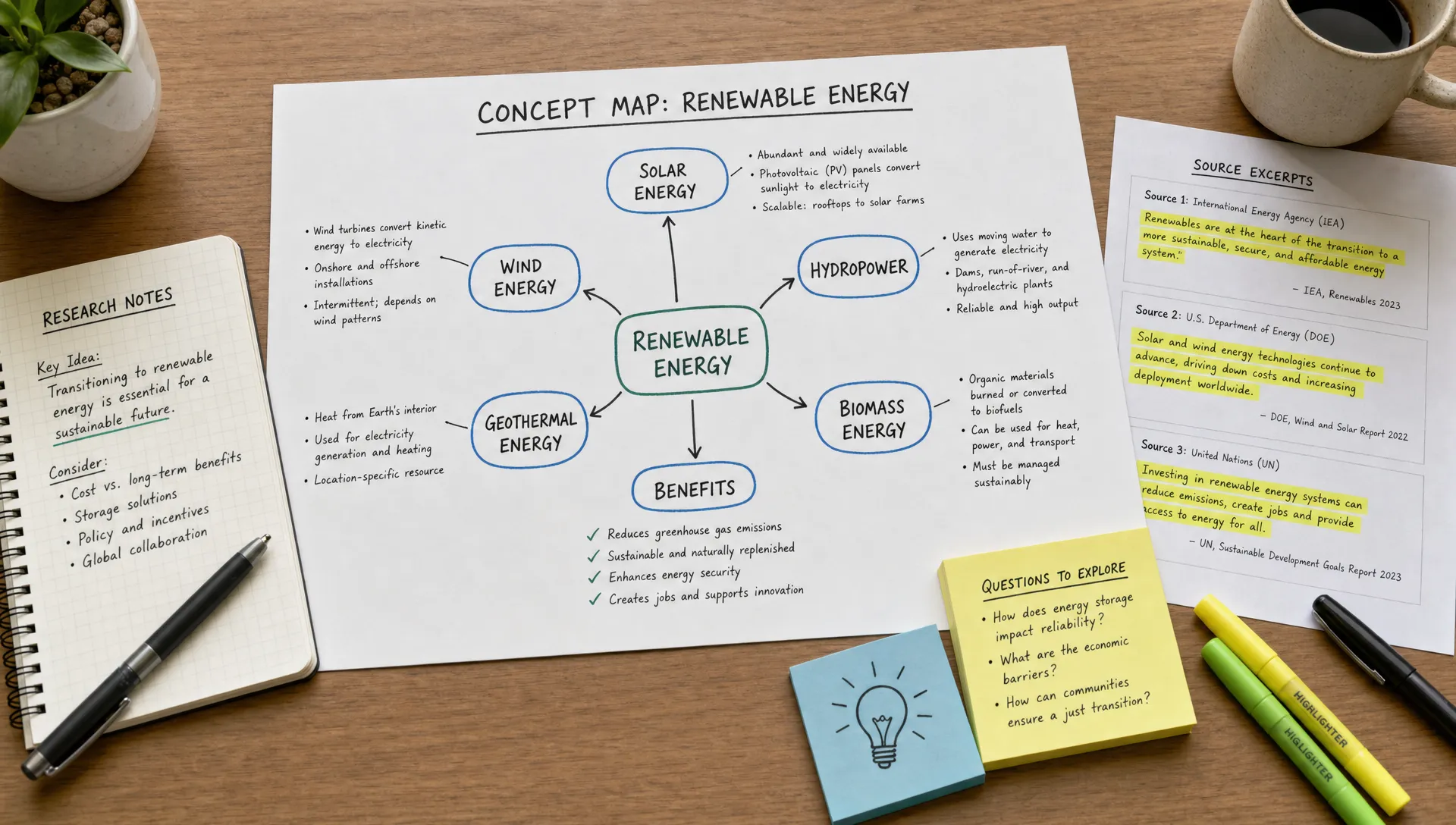
4. Group the map into clusters
A complex map is easier to read when related concepts are grouped. Clusters may represent sections of an article, parts of a theory, steps in a process, or themes across sources.
For a research paper, common clusters include theory, method, results, limitations, and implications. For a business report, clusters might include market context, customer problem, risks, recommendations, and next steps.
You can ask the generator to organize concepts into 3 to 6 clusters. More than that often becomes visually noisy.
5. Add examples and evidence
A concept map should show the structure of understanding, but it should not detach ideas from the source. Add a few examples, data points, quotes, or page references where they matter.
For students, this helps with exam recall because you can connect the abstract idea to a concrete example. For researchers, it helps you avoid vague summaries that lose methodological detail. For professionals, it helps you defend a recommendation because the map points back to evidence.
A good rule is to add evidence only where it strengthens understanding. Do not turn every node into a citation dump.
6. Review for false clarity
AI-generated maps can look confident even when they are incomplete. Before you trust the output, check for false clarity.
Ask yourself:
- Are any relationships too vague, such as “relates to” or “connected with”?
- Are causes and correlations clearly separated?
- Are opposing views shown, or did the map flatten disagreement?
- Are important limitations missing?
- Are minor details taking too much space?
- Could someone explain the topic from the map without reading every node aloud?
This review step is what turns generated output into actual learning.
Prompt templates for better concept maps
The quality of your map depends heavily on the instruction you give the tool. Generic prompts produce generic diagrams. Specific prompts produce useful visual notes.
Here are several reusable prompt templates.
For studying a chapter: “Create a concept map from this chapter that answers: What are the main ideas, how do they relate, and what examples explain them? Use short concept labels, clear relationship labels, and 4 to 6 clusters.”
For a research paper: “Create a concept map of this paper. Separate theory, research question, method, findings, limitations, and implications. Label each connection with a specific relationship. Include page references or section names where useful.”
For comparing multiple sources: “Create a concept map comparing these sources. Show shared concepts, disagreements, different methods, and areas where one source extends or challenges another.”
For a video lecture: “Create a concept map from this transcript. Focus on the speaker’s framework, key claims, examples, and practical steps. Remove repetition and keep the map reviewable.”
For content creation: “Create a concept map that turns this source into an outline for an article, video, or newsletter. Show the central idea, supporting points, examples, objections, and possible audience takeaways.”
These prompts work because they define the purpose, structure, and quality criteria. You are not just asking for a map. You are asking for a map that supports a specific kind of thinking.
Use concept maps for different learning and work goals
The same concept mapping generator can support different workflows depending on your goal.
Students can use concept maps to prepare for exams by turning readings into reviewable structures. Instead of rereading the same chapter passively, they can cover parts of the map and try to explain the missing links from memory.
Researchers can use concept maps to understand papers faster. A map can show how the research question connects to the method, how the findings support or fail to support the hypothesis, and where limitations affect the strength of the conclusion.
Knowledge workers can use concept maps to make reports more usable. A 40-page strategy document may contain goals, constraints, dependencies, risks, and recommendations. Mapping those relationships can make the document easier to discuss in a meeting.
Content creators can use concept maps to repurpose long material. A podcast interview might become a newsletter, a short script, a carousel, or an article outline once the core ideas and examples are visible.
Educators can use concept maps to prepare lessons. A map can reveal what students need to understand first, where misconceptions may appear, and which examples make abstract concepts easier to teach.
If your goal is specifically to make a source more visual for sharing or presentation, unrav.io also offers a way to turn articles, PDFs, and videos into clean visual outputs, which can complement your concept mapping workflow when you need something easier to communicate.
A simple example: turning a dense article into visual notes
Imagine you are reading an article about how remote work affects productivity. Linear notes might capture separate points like “fewer interruptions,” “communication delays,” “employee autonomy,” and “manager trust.” Useful, but not yet connected.
A concept map might structure the same material like this:
| Concept | Relationship | Connected concept |
|---|---|---|
| Remote work | increases | schedule flexibility |
| Schedule flexibility | can improve | deep work time |
| Remote work | can reduce | spontaneous collaboration |
| Communication delays | may create | project coordination problems |
| Manager trust | moderates | remote work effectiveness |
| Clear documentation | reduces | coordination problems |
| Employee autonomy | supports | motivation |
This is already more useful than a list because it shows conditions. Remote work is not simply “good” or “bad” for productivity. Its effect depends on documentation, collaboration needs, autonomy, and management practices.
That is the kind of understanding visual notes should support.
Common mistakes to avoid
A concept mapping generator can speed up your workflow, but it cannot decide what matters for your purpose. Watch for these mistakes.
First, avoid maps that are too large. If your map has 80 nodes, you may have created a visual version of information overload. Start with the core structure, then expand only where needed.
Second, avoid unlabeled arrows. A line between two concepts should say something. If you cannot label the relationship, you may not understand it yet.
Third, avoid treating the first output as final. Generated maps often need pruning, correction, and reorganization. Move the most important ideas closer to the center, remove weak nodes, and rewrite vague labels.
Fourth, avoid mixing summary and analysis without distinction. If a source says one thing and you infer another, mark that difference. This is especially important in academic and professional work.
Finally, avoid visual decoration that does not support thinking. Color, icons, and layout can help, but only when they clarify structure. A plain map with precise relationships is better than a beautiful map that hides confusion.
How to know if your concept map is actually useful
A finished concept map should help you do something better than before. It should make the topic easier to explain, remember, critique, or apply.
Use this quick quality checklist:
| Test | What to look for |
|---|---|
| Explanation test | Can you explain the topic using the map without rereading the source? |
| Relationship test | Do most arrows have meaningful labels? |
| Focus test | Does the map answer one clear question? |
| Evidence test | Are key claims connected to examples, data, or source sections? |
| Revision test | Did you remove weak, duplicate, or unnecessary nodes? |
| Transfer test | Can the map become flashcards, an outline, a lesson, or a brief? |
The transfer test is especially important. Good visual notes should not be a dead end. They should help you write, study, teach, decide, or create.
Frequently Asked Questions
What is a concept mapping generator? A concept mapping generator is a tool that helps turn source material into a visual network of concepts and relationships. It can identify key ideas, suggest connections, and create a first draft that you can revise into clearer visual notes.
Is a concept map better than a summary? It depends on your goal. A summary is better when you need a quick overview. A concept map is better when you need to understand relationships, such as causes, dependencies, examples, contradictions, or parts of a system.
Can I use a concept mapping generator for research papers? Yes. It can help you separate the research question, theory, method, findings, limitations, and implications. You should still verify the output against the paper, especially for methods, statistics, and nuanced claims.
How many concepts should a concept map include? For most visual notes, 15 to 30 concepts is a useful starting range. Smaller maps are easier to review. Larger maps can work for major projects, but they should be divided into clusters.
Do concept maps help with studying? Yes, when you actively use them. The benefit comes from explaining relationships, testing recall, and revising the map as your understanding improves. Simply generating a map is less useful than working with it.
Build visual notes you can actually think with
A concept mapping generator is valuable because it reduces the friction of starting. It can help you move from a blank page to a structured view of the material faster. But the real benefit comes from what you do next: refine the relationships, remove noise, add evidence, and turn the map into a tool for learning or work.
If you regularly read long articles, PDFs, research papers, reports, or watch information-heavy videos, try using unrav.io before you build your next map. It can help you clarify the source, reframe the content for your goal, and surface the ideas that deserve a place in your visual notes.
Better visual notes are not about making information look impressive. They are about making complex material easier to understand, remember, and use.