
How a Knowledge Map Maker Helps Compare Research Sources
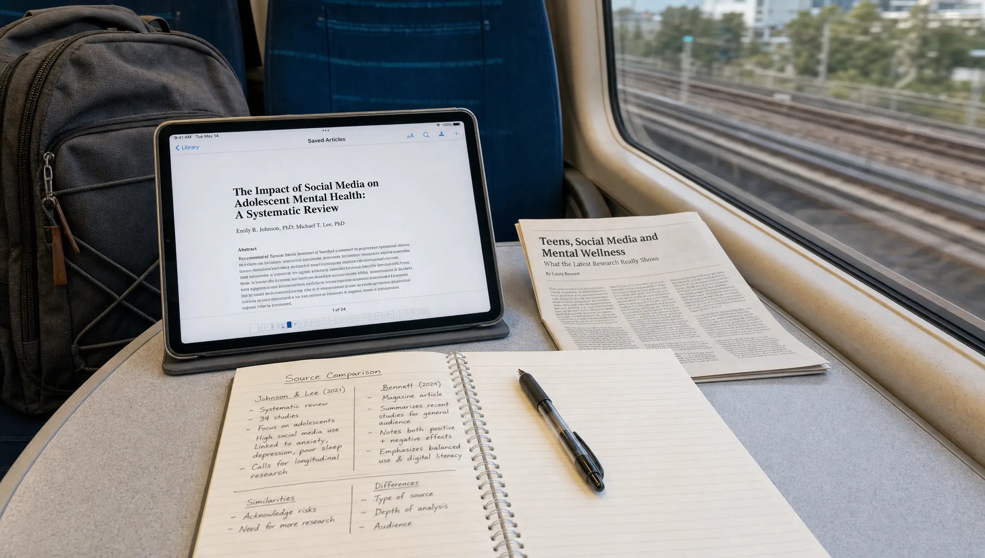
Research rarely comes in a neat stack of sources that agree with each other. One paper defines the problem one way, another uses a different method, a report adds industry context and a lecture or podcast gives a useful explanation that is hard to cite directly. After a few hours of reading, your notes may contain plenty of highlights but still fail to answer the real question: how do these sources compare?
A knowledge map maker helps by turning scattered reading into a structured view of claims, evidence, methods, definitions and relationships. Instead of treating each source as a separate summary, you can see which ideas overlap, where findings conflict and what gaps still need investigation.
For students, that means clearer study notes. For researchers, it supports literature review and synthesis. For analysts, educators and creators, it makes long source lists easier to turn into briefs, lessons, reports or content outlines.
What a knowledge map maker does for research comparison
A knowledge map is not just a prettier version of your notes. It organizes information around relationships. In research work, those relationships often matter more than the individual facts.
A standard summary tells you what one source says. A comparison table helps you line up source details. A knowledge map shows how ideas relate across sources, such as which authors use similar definitions, which findings depend on similar methods and which conclusions are supported by stronger evidence.
A knowledge map maker can help you move from linear reading to relational thinking. Instead of asking, “What did this article say?” you start asking better questions:
- Which sources support the same claim?
- Which sources disagree, and why?
- Are the studies measuring the same thing?
- Do the sources use comparable samples, timeframes or definitions?
- What evidence is missing from the conversation?
This is especially useful when you are working with PDFs, reports, long articles, recorded lectures, YouTube explanations or interview transcripts. A tool like unrav.io can help you understand dense material in different modes before you turn it into map-ready notes, especially when you need a quick grasp first and deeper insight later.
Why comparing research sources is harder than summarizing them
Summarizing is usually source by source. Comparison is cross-source. That difference is why many literature reviews, essays and research briefs get stuck.
When you summarize one article, you can follow its structure: introduction, method, findings, conclusion. When you compare ten sources, that structure breaks down. You need to reorganize everything around your research question.
The difficulty often comes from five common problems.
First, sources use the same terms differently. In education research, for example, “engagement” might mean attendance, participation, time on task or emotional investment. If you miss that distinction, two sources may look like they agree when they are actually measuring different things.
Second, methods are not always comparable. A randomized trial, survey, case study, systematic review and opinion essay can all discuss the same topic, but they do not carry the same type of evidence. A map helps you keep the method visible instead of burying it in a paragraph of notes.
Third, sources may answer different versions of your question. One paper might ask whether a tool improves learning outcomes, while another asks whether students feel more confident using it. Both may be relevant, but they should not be treated as identical evidence.
Fourth, findings often depend on context. A study conducted with first-year university students may not apply cleanly to adult professionals, high school learners or advanced researchers. The source may be useful, but the boundary matters.
Fifth, your own highlights can mislead you. Highlighting captures what seemed important at the moment. It does not automatically show what is central, repeated or contested across the whole body of material.
How knowledge mapping changes the comparison process
The real value of a knowledge map maker is that it lets you compare sources through shared categories rather than page order. You can group material by concepts, claims, methods or themes, then connect sources to those categories.
For example, imagine you are comparing sources on remote work productivity. A linear note system might give you ten summaries. A knowledge map could show:
- Claims about productivity increases
- Claims about collaboration costs
- Evidence based on employee surveys
- Evidence based on performance metrics
- Differences between hybrid, fully remote and office-first teams
- Gaps around long-term career development
That structure makes comparison easier because each source has a place in the larger argument. You are no longer switching between documents and trying to hold everything in working memory.
If you are still choosing the right visual format, the distinction between maps matters. A mind map is often best for brainstorming or branching from one central topic, while a concept map is stronger for showing labeled relationships. For a broader breakdown, unrav.io’s guide on when to use a mind map maker for reading and research explains when visual mapping is most useful during reading-heavy work.
A practical workflow for comparing research sources
You do not need a complicated system to start. The goal is to make your thinking visible enough that you can compare sources without rereading everything from scratch.
Start with one comparison question
Before adding sources, write one sentence that explains what you are comparing. Keep it specific.
Weak question: “What does the research say about AI in education?”
Better question: “How do recent sources compare on whether AI writing tools improve student revision quality?”
A focused question tells you which details matter. Without it, your map becomes a storage area for interesting information instead of a tool for judgment.
Break each source into comparable units
For each source, extract the same core fields. This makes comparison fairer and faster.
| Field | Why it matters |
|---|---|
| Research question or purpose | Shows what the source is actually trying to answer |
| Key claim | Captures the central argument or finding |
| Method | Helps you weigh the type of evidence |
| Population or context | Shows where the finding may or may not apply |
| Main evidence | Separates supported claims from broad assertions |
| Limitations | Keeps uncertainty visible |
| Useful quote or page reference | Helps you return to the source when writing |
This step works well with AI assistance, but it still needs human review. AI can help you pull out candidate claims or simplify dense sections, but you should check important details against the original source, especially methods, results and limitations.
Group sources by claim, not by author
Many people organize research notes by source name: Smith 2024, Lee 2023, industry report, lecture notes. That is useful for citation management, but it is not enough for synthesis.
A better comparison map groups sources around claims and themes. For example:
- “AI feedback improves revision speed”
- “AI feedback may reduce originality”
- “Benefits depend on teacher guidance”
- “Students need training to evaluate suggestions”
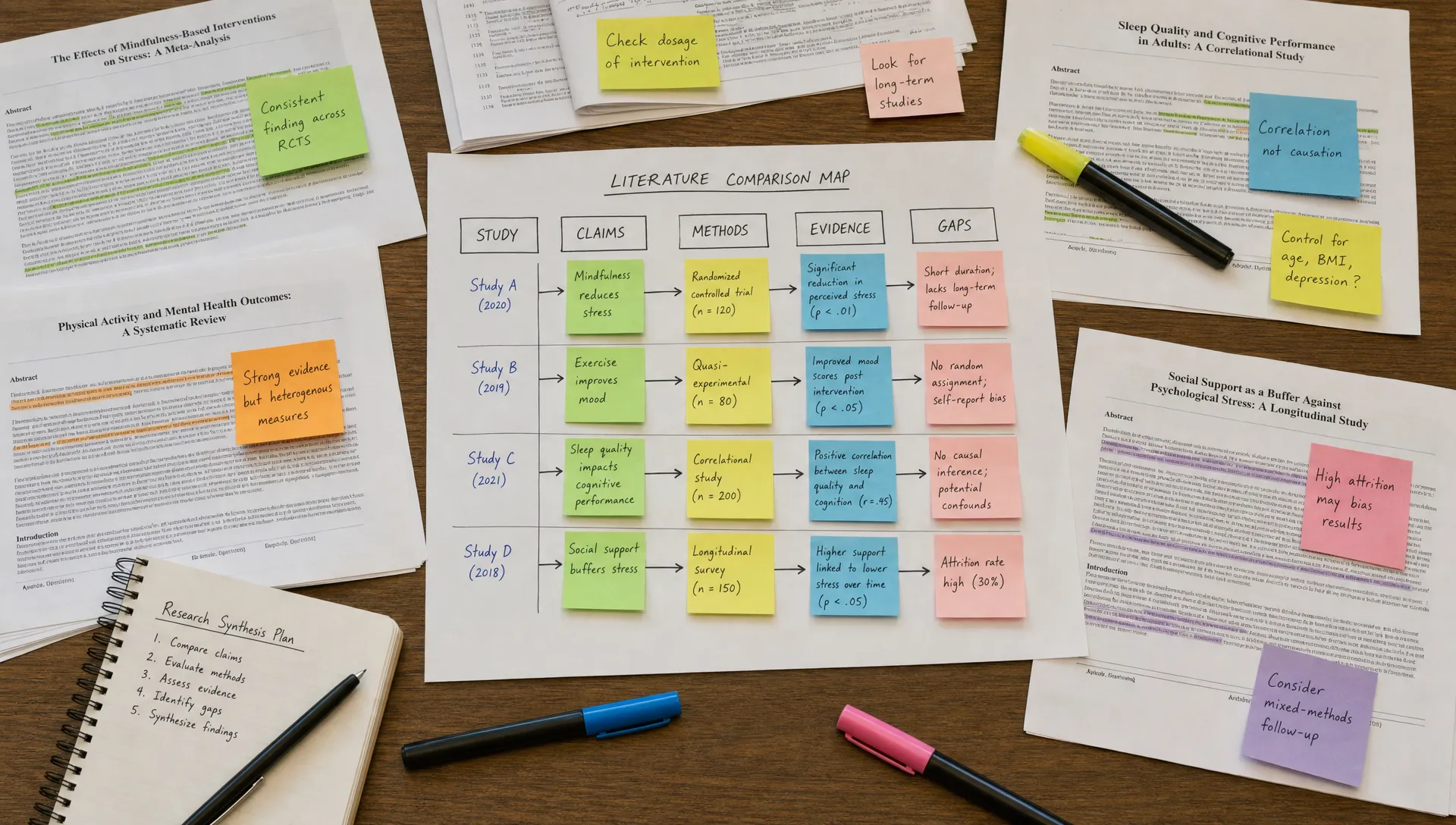
Each source can then connect to one or more claims. This makes patterns visible. If five sources support one claim but all use self-reported survey data, your map can show both the apparent agreement and the evidence limitation.
Label the relationships clearly
A map becomes much more useful when the connections are labeled. A line between two ideas is vague. A labeled connection explains the relationship.
Useful labels include:
- Supports
- Contradicts
- Defines
- Extends
- Uses same method as
- Studies different population than
- Provides background for
- Raises limitation of
These labels force precision. If you cannot name the relationship, you may not understand it yet. That is a signal to reread, simplify the source or place it in a temporary “unclear” area.
Separate evidence from interpretation
When comparing sources, it is easy to mix what a source found with what you think it means. Both are useful, but they should not look the same in your map.
One simple approach is to use three categories: source claims, evidence details and your interpretation. Source claims capture what the author argues. Evidence details capture the basis for that argument. Your interpretation captures how the source fits your project.
This is especially helpful for research writing because it prevents overclaiming. You may believe several sources point toward a strong conclusion, but your map should show whether that conclusion is directly supported or built from your synthesis.
Example: comparing four sources for a literature review
Imagine you are writing a literature review on whether short-form educational videos help students learn complex topics.
Your four sources might include:
| Source type | What it might contribute | What to compare |
|---|---|---|
| Experimental study | Measures learning outcomes after video use | Assessment design, sample size, control condition |
| Student survey | Captures learner attitudes and perceived usefulness | Self-report limits, learner background |
| Instructor interview study | Shows how teachers integrate videos into lessons | Teaching context, implementation challenges |
| Review article | Summarizes patterns across many studies | Inclusion criteria, scope, strength of conclusions |
A normal set of notes may leave these as four separate summaries. A knowledge map can connect them around shared questions:
- Do videos improve understanding or only confidence?
- Are videos used before class, during class or for revision?
- What makes a video effective for complex material?
- Which findings are based on performance data rather than perception?
With that structure, your literature review becomes easier to write. You can organize paragraphs around themes instead of source order. One paragraph might compare evidence for learning outcomes, another might discuss student motivation and another might address teaching conditions.
A knowledge map maker is useful here because it reduces the mental effort of holding all four source types in your head at once. It does not decide your argument for you. It gives you a clearer surface to reason on.
Where unrav.io fits into the research comparison workflow
A research comparison workflow often has two parts: understanding each source and synthesizing across sources. Many people jump to synthesis too early, then realize they only half-understood the original material.
unrav.io is designed for the first part of that workflow. It helps turn articles, PDFs, YouTube videos, podcasts or pasted text into clearer outputs using different thinking modes. You might use it to get a quick grasp of a dense report, reframe a paper for deeper insight or turn a source into a teachable explanation before adding it to your map.
That matters because poor source comparison often starts with uneven understanding. If you understand Source A deeply but only skim Source B, your synthesis will be biased toward the source you processed better.
For larger projects that involve articles, videos, podcasts and notes, you may also find it helpful to review how to build holistic understanding from multiple sources. That workflow pairs well with knowledge mapping because both focus on connecting ideas rather than collecting isolated summaries.
What to look for in a good knowledge mapping workflow
A good knowledge map maker or map-supported workflow should help you compare sources without trapping you in formatting work. Beautiful diagrams are less important than accurate relationships.
Look for support in five areas.
First, the workflow should accept the kinds of material you actually use. Academic projects often involve PDFs and journal articles. Professional projects may include reports, webpages, meeting notes and videos. Creator workflows may include podcasts, interviews and long-form essays.
Second, the outputs should be editable. AI-generated notes are starting points, not final interpretations. You need to rename nodes, correct claims, add missing context and remove weak connections.
Third, source traceability matters. When you write a paper or brief, you must be able to return to the original source. A useful map should preserve enough source detail that you can verify the claim later.
Fourth, the workflow should support multiple levels of detail. Early in a project, you may need a broad map of themes. Later, you may need a tighter map of evidence, methods and disagreements.
Fifth, the tool should reduce friction. If making the map takes longer than understanding the sources, people stop using it. The best workflow is one you can repeat every time you read something important.
Common mistakes when comparing sources with maps
Knowledge maps are powerful, but they can create a false sense of clarity if you use them carelessly.
One common mistake is mapping everything. Not every detail deserves a node. If a fact does not help answer your comparison question, leave it out or store it in regular notes.
Another mistake is treating every source as equal. A peer-reviewed systematic review, a small exploratory study, an industry white paper and an opinion article may all be useful, but they should not carry the same evidentiary weight. Your map should make source type and method visible.
A third mistake is hiding uncertainty. If two sources conflict, do not force them into agreement. Mark the conflict and investigate why it exists. The difference may come from method, population, timeframe, definition or quality of evidence.
A fourth mistake is letting the map replace reading. A map is a guide to comprehension, not a substitute for expert judgment. For high-stakes academic, medical, legal or policy work, always check the original source before relying on a claim.
How different readers can use knowledge maps
The same method can support different goals. The map structure changes depending on what you need to produce.
| Reader | Main goal | Useful map focus |
|---|---|---|
| Student | Prepare for essays or exams | Key concepts, definitions, examples and disagreements |
| Researcher | Build a literature review | Methods, findings, gaps, citations and limitations |
| Analyst | Compare reports or market sources | Claims, evidence quality, assumptions and business implications |
| Educator | Prepare lessons | Prerequisite ideas, misconceptions, examples and explanations |
| Creator | Repurpose long research into content | Themes, audience questions, supporting evidence and story angles |
For example, a student may map three textbook chapters and two papers around exam themes. A researcher may map twenty papers around methods and findings. A content creator may map reports and podcasts around audience questions, then turn the strongest clusters into article sections or video outlines.
The tool is flexible because the core problem is the same: too much information, not enough visible structure.
A simple template you can reuse
If you want to try this today, use a small structure before moving into a larger tool.
Create five columns or map areas:
- Source
- Main claim
- Evidence or method
- Relationship to other sources
- Your synthesis note
Then process each source in the same way. Keep the first pass rough. Your goal is not to produce a perfect map immediately. Your goal is to create enough structure to see comparison points.
After the first pass, look for clusters. Which claims have the most support? Which claims depend on weak evidence? Which sources are useful mainly for definitions or background? Which ones directly answer your question?
Once those clusters are visible, writing becomes easier. Your paragraphs can follow the map: introduce a theme, compare the evidence, explain the disagreement, then state what the pattern means for your research question.
Frequently Asked Questions
What is a knowledge map maker? A knowledge map maker is a tool or workflow that helps organize concepts, claims, evidence and relationships into a visual or structured map. For research, it is most useful when you need to compare several sources rather than summarize them one by one.
How is a knowledge map different from a mind map? A mind map usually branches from one central idea and is helpful for brainstorming or review. A knowledge map focuses more on relationships between ideas, sources, claims and evidence, which makes it stronger for research comparison.
Can AI compare research sources accurately? AI can help extract claims, simplify dense writing and suggest connections, but it should not be treated as automatically accurate. You still need to verify important details, check the original sources and make your own judgment about evidence quality.
Do I need a knowledge map for every research project? No. For one or two simple sources, a summary may be enough. A map becomes more valuable when you have multiple sources, conflicting findings, complex terminology or a writing task that requires synthesis.
Can I use knowledge maps for non-academic sources? Yes. Knowledge maps can help compare industry reports, newsletters, podcasts, videos, expert interviews and internal documents. The key is to separate claims, evidence, assumptions and context.
Turn scattered sources into clearer understanding
Comparing research sources is difficult because the important work happens between documents. You need to see how definitions, methods, findings and assumptions relate. A knowledge map maker gives you a practical way to make those relationships visible.
Start small. Choose one research question, process three to five sources and map the claims they make. Then label the relationships: support, contradict, extend, define or limit. You will quickly see which sources are central, which ones provide background and which gaps still need attention.
If your sources are dense or spread across PDFs, articles, videos and podcasts, unrav.io can help you understand each piece before you compare it. Use it to get a clearer first pass, then build your map from better notes and sharper questions.